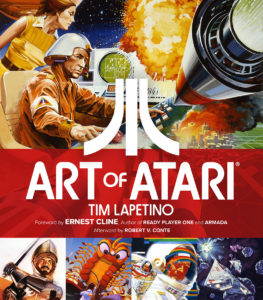
 Art Of Atari, the fantastic new book by Tim Lapetino and produced by Dynamite Entertainment, is not necessarily a book devoted to the video gamer community. They’ll find plenty to enjoy about it, as the book is loaded with details about how the first home gaming phenomenon came to be, from vertical lines bouncing a square across a digital ping-pong table to the innovation of a unit with plug-in modules providing a multitude of game experiences. The real thrill of the book, however, is the final admission that among all this kids’ stuff, a new paradigm for graphic arts was being established.
But let’s not get ahead of ourselves. Let’s go back to the late 1970s when video games were starting to make their cultural impact. As revered and well-remembered as those seminal arcade games were, they were also fairly crude. There was no choice in that matter. In order to create the Space Invaders or Asteroids we recognize, the technology of the era initially required that huge video stand-up cabinet. Game creator Atari was expanding the boundaries by creating home machines that families could play together, but microprocessor miniaturization was a few years away. Adaptations and simplifications had to be made.
 For those who still have a warm heart for those home games, like I do, we accepted those limitations. Pac Man was no longer round, but octagonal. Cars looked like moving pyramids, and so did tanks. Come to think of it, so did planes. But it didn’t matter. Along with the rudimentary shapes came color, sound, and movement, and for generations brought up on variations of the same handful of board games, being able to play so many different games with a single machine was a revolution all its own.
Still, you couldn’t put the screen graphics on the game cartridge boxes and expect people to get excited about them. From day one, the fierce, flame-throwing dragon of Adventure looked like a hopping duck, and still does. So something had to bridge that imagination gap and, lucky for us all, Atari knew what that needed to be. The design team that worked under their iconic corporate symbol — like three pathways converging into one — was comprised of skilled illustrators who brought excitement to the toy store shelves that stocked Atari games.
 Graphic design for the purposes of marketing is tricky. You always need to remember that the goal is to sell the product, but if your concepts are too blunt the consumer will reject them. People want to be sold but they don’t want to be hassled into the sale. The best marketing design gives you that advertising requirement but, on occasion, also can stand on its own as an artistic accomplishment.
Art of Atari is a celebration of the people who shaped the aesthetic that helped push Atari into homes everywhere. Coming out of the ’70s when mustard, orange, and brown was the only color combination, the bright rainbow of cartridge box covers was nearly revelatory. Artists like Cliff Spohn, Chris Kenyon, and George Opperman were producing book-quality paintings to go over top those bold colors, and helped inform gamers about “what was really going on” inside those avatars on screen. The smooth, glossy work of Hiro Kimura did more than parallel the slick, neon ’80s, the work helped shape the persona of the decade. The hyper-cartoon look of Marty Viljamaa’s work presaged a world that Nintendo would own in only a few years’ time.
 At 354 pages, I don’t think you will ever see as comprehensive a book on the art of marketing video games as Art of Atari is. If you do, it will be because of the book’s existence. The pictures are as immersive as ever, reproduced from private collections and rare materials and printed on super-white paper so that the colors really “pop.” The history is equally fascinating, from the development of that corporate logo to the company’s waning days.
There’s even a section devoted to one of Atari’s darkest times. Having been crushed by poor sales, the company had a huge problem. They went hard after the licensing for the film E.T. The Extraterrestrial. Given a finite amount of time to make the game in order to get carts on shelves before Christmas, corners were cut. Mistakes were made. The cover art was brilliant, but the game itself couldn’t levitate out of its hole, like the titular alien. For the few that bought the game and wound up flinging the cartridge across the room in frustration, it was hopeless. Taking that same cue from the game, the Atari Corporation buried a massive amount of unsold cartridges in a landfill in Alamogordo, New Mexico.
 This mass grave of games existed only as a legend until just recently. The dump was unearthed. This is also found in the book, so you really do get the complete nuts, bolts, warts, and all history of this establishment.
But aside from this, you get a level of visual invention that somehow transcends the original intention for the art — to create a fantasy that informs the unavoidable reality. With present games as visually lush as these paintings were then, one might get the feeling that progress has been made. Technically, yes. And in terms of game play, many of these modern games are fun, but they’re also kind of an exercise in loneliness. Most are meant to be played by individuals, and even in multiplayer online games you’re communicating with others but within the game. Your friends and competitors are rarely sitting right beside you, waiting for a shot at showing you up.
In other words, Art of Atari documents a time when games required you to bring something to them, rather than them giving you an entire world to get lost in. You had to participate with your imagination as well as other players, and the art that’s recorded in the book honors this mutual cooperation. For a devotee of early gaming, this thick book is required reading. For those who appreciate how design affects public perception, this book is a master class on manipulating psychology with imagery. And for those who just love terrific and fun art books that blow you away, page after page, Dynamite Entertainment’s Art of Atari is a must-have.


Comments