It’s that time of the month again…time for another Confessions of a you-know-what, in which I opine on various comics and graphic novel releases in the last month, most of which should be on sale at a comics shop or online retailer in your general vicinity.
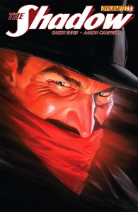
 THE SHADOW #1
Script: Garth Ennis, Art:
Dynamite Entertainment; $3.99
So many legacy heroes have been revived in the last decade or so by companies like Dynamite, Moonstone, and others that I suppose it was inevitable that one of them should get around to arguably the most potent and interesting of them all: The Shadow. When it comes to comics, Ol’ “Who Knows What Evil Lurks” has had it pretty good, all things considered– if you overlook the oddball long-underwear Archie Comics version, there was the 70’s DC series, which featured excellent art by Mike Kaluta (whose version in a lot of ways defined the character for everyone for decades after, and remains one of the characters the artist is most associated with), Frank Robbins, and E.R. Cruz as well as some terse and clever (if somewhat formulaic) scripts by Dennis O’Neil; then the irreverent but typically Chaykin 80’s revival, which eventually was turned over to Andrew Helfer and Kyle Baker, who ramped up the absurdity and created a masterpiece of black comedy. At about the same time that DC was pissing off the hardcore fans with that version, Marvel got the opportunity released a handsome hardcover graphic novel which featured the return of O’Neil and Kaluta, paired with the great Russ Heath on inks. The Shadow (out of costume) was also a cameo player in Dave Stevens’ Rocketeer series. After that, there have been a few miniseries under the Dark Horse banner in the wake of the misbegotten 1994 movie but at least sporting Kaluta covers and in a couple of cases, interiors by MWK and Gary Gianni; their failings were mostly due to routine stories rather than art. But since then, there haven’t been a lot of appearances by de “Mon in Block” (that’s what Percy Jenifah called him, and I hope you get the reference) in mainstream comics. Until, of course, now.
It’s Garth Ennis’ turn to step up to the plate, and while he’s as irreverent as Chaykin or Helfer, he’s always been able to walk that fine line between parody and adventure without falling, as is borne out by his stints on such titles as Hitman and The Punisher, so while I was at first taken a bit aback (he’s been spending the last couple of years pissing on superheroes via The Boys), it makes a lot of sense for him to be doing the Shadow, in a lot of ways the original vigilante anti-hero. Of course, there’s also his concurrent series, the Last Kiss Goodnight-ish Jennifer Blood, which is in that area code as well but didn’t impress me much so I haven’t been following it. I’m a bit surprised by how straight Garth is playing it so far; of course, it’s only one issue but other than some tweaks in how the Shadow’s alter ego Lamont Cranston regards agent Margo Lane (in some versions, the love interest; in others, not so much), this is mostly boilerplate Shadow, with another of Ennis’ fixations, World War Two and Army comics in general, folded in; Garth has his Shadow wax a bit more poetic, and contrary to his usual portrayal as a remorseless killing machine he actually spares the life of a small fry gangster, which is a bigger twist than you’d think. Set just before the U.S.’s involvement in that conflict, we begin with the Shadow recounting Japanese war crimes (Garth’s Shadow is a right poetic fellow), then we show him busting up some dockside transaction between agents of Japanese-connected mobs…then shift to a lot of exposition in a hotel dining room with Cranston and some government agents, one of whom wonders how Cranston manages to know so much. Then, a quiet nighttime scene with Cranston and Margo, which lets Garth show us how the Shadow’s relationship with his agents works. It’s all a lot of setup and stage-setting, but that sort of thing is necessary and Ennis is an old hand at the sort of thing by now, so I’m pretty confident that he will be able to build something special out of it all. I just hope that he avoids the tendency to over-complicate, which has often made The Boys a chore to parse from time to time. Artwise, Aaron Campbell aspired to Kaluta’s period flavor and the down-to-Earth feel of someone like Tommy Lee Edwards or John Paul Leon, and he almost succeeds; he’s just too steeped in superhero art tradition to really pull it off, but he does the early mob battle scene very well and only his struggle to draw faces in three-quarter profile mars his talking heads scene later on. He’s no Kaluta, but he’s good enough and that sometimes has to do with companies like Dynamite. Could have been worse- he could have been some Jim Lee or J. Scott Campbell acolyte.
I’m a lifelong (well, since age 13 anyway) fan of the character in nearly all of his incarnations, so I’m fully invested. I think it will be interesting to see what comics’ arguably greatest iconoclast will bring to the vigilante who, as O’Neil always reminded us, “Never fails”. If you’re interested in the Shadow, or like what Ennis brings to the party, you should give this a shot- it’s true to what has come before, and looks like it will be executed with a bit of flair…and that’s all we can ask for these days.
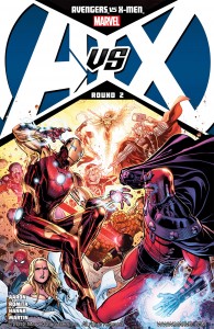
 AVENGERS VS X-MEN #0-2
Script: Brian Michael Bendis & Jason Aaron, with input from Ed Brubaker, Matt Fraction, and Jonathan Hickman; Art: Frank Cho, Jason Keith (#0), John Romita Jr. & Scott Hanna.
Marvel, $3.99
Big Two event comics have become like a poker game- I’ll see your 52 and raise you one Civil War; I’ll see your Fear Itself with one New 52 company-wide relaunch. Here’s Marvel’s reaction to that, featuring most of the high-profile Marvel stable in the sort of internecine conflict that Stan and Jack would have done in one issue, or at least a 25 cent giant-size annual, back in the day. No matter; this is Cape Comics As They Are Now, and all we can do is follow along, or ignore if needs must, but this ship’s not changing course anytime soon. So…what do we have here?
At least two storylines: first, after the events of one of the previous Big Line-Wide Multi-Title Crossover Epics, in which she betrayed everyone after turning eee-vill, we have the now-reformed (or at least now-sane; I didn’t read that previous series so I’m not 100% sure) Scarlet Witch, who seems to want to reunite with her Avengers friends and lovers, but knows she’s not welcome by at least half the group; most of this is shown in the #0 preliminary issue and is conveyed quite well by Bendis and Cho. Cho does what he does best, drawing pretty people very well, with a nice sense of timing and layout.
There were, I do believe, other preliminary titles that came before AvsX #1, but I didn’t read any of the others so we’ll just move on to there…and the crux of the biscuit, as it were, is that the Phoenix Force is coming back to Earth to possess Hope Summers, Scott (Cyclops) Summers’ daughter from a future timeline- or something else related to all the convoluted nonsense that led me to stop reading X-books in the mid-80s. Anyway, Scott’s trying to train and prepare her and keep her isolated; Hope wants to go out and fight evil and stuff and sneaks out to do that very thing. There’s a lot of parental angst, because, well, it’s an X-book and not even the usually reliable Jason Aaron (who, if I understand it, writes the Hope-centric sections) can keep it from dipping into melodrama. The Avengers and S.H.I.E.L.D. get wind that the Phoenix Force is coming, and head out to “Utopia Island”, just outside of San Francisco (next to Alcatraz, I guess) to persuade Scott to turn Hope over before the Force gets to her. Of course, the X-Men aren’t down with this plan, and let the brawling begin. There is some reasonably well-executed dramatics here, though all the fighting tends to overshadow everything else. The bulk of the art in #’s 1 & 2 is by John Romita Jr. with inks by Scott Hanna, and maybe it’s me or Hanna’s influence, but Jr. is working in a somewhat different style than I remember from back in the day (but similar to what I recall from Kick Ass), like he’s been looking at a lot of Art Adams, Moebius, Manera or Steve Dillon, trying to get a little Euro artcomix flavor in there- everyone is slimmer, leaner and trimmer, except their heads, which look a bit oversized in many panels. I’ve enjoyed his work in the past; he’s capable of nuance, then equally adept at big widescreen slobberknocker battle scenes as well, so he’s never a dealbreaker for me like many others of his generation are. I’m sure he’s having to push himself a bit to stay on deadline, and the occasional empty background or sketchy figure bears this out, but it looks like Hanna will help out a lot.
Honestly, as Big Sprawling Multi-Title Event Money Grabs go, I’ve seen worse; any flaws in the story (and I’m sure it’s a tough task to stay on point given the gnarly histories of all these characters, not to mention the plethora of cooks in this particular kitchen) pass by without calling attention to themselves, and there are some nice little bursts of characterization peeking out when they’re not all slugging and blasting each other with abandon. Romita and Hanna make it all look presentable. On a geeky note, as a fan of the recently-ended Abnett/Lanning Guardians of the Galaxy series, I have to wonder why they’re not taking part in this, especially because we see a Nova appearance at the very beginning of #1. Oh well. It’s all very full of itself, and definitely recalls 70’s-80’s Marvel in its echoes of Claremontian Pretension Past. This is strictly lowest common denominator stuff all the way; a McDonald’s not-so-happy meal for Marvel devotees and the less discriminating among us. You can do better, sure, but you can do worse.
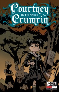
 COURTNEY CRUMRIN #1
Script/Art: Ted Naifeh; Color: Warren Wucinich
Oni Press, $3.99
I’ve been enjoying the exploits of Naifeh’s surly young noseless tweenage witch since the beginning; he has created an interesting and typically dark world and populated it with a host of interesting characters and situations, to be sure inspired by many similar ideas that have come before, but Naifeh has the chops to put his own spin on them and make them into his own. Previous installments have been in black and white, and have not only shown us the ups and downs of Courtney’s coming-of-age as a young magic practitioner with an old and powerful family heritage, but also have given us some insight on her reclusive Uncle Aloysius, who is quite the power in his own right. This time out, a new family moves next to Courtney and her uncle, and that brings a new friend of sorts named Holly, another alienated gotily-attired tweenager who takes up with CC at first out of curiousity, but soon gets a glimpse into what her neighbor is all about (and even worse) persuades her to teach her magic, which she uses to her own ends in such a selfish, threatening way that our girl is obliged to teach her a lesson, the nature of which kinda reminded me that the lead isn’t always the nicest little magic user out there. The “next issue” page shows that there will be more to come between the two, so stay tuned- Holly Hart may turn out to be the clear-cut antagonist that this series hasn’t really had, or perhaps an ally, who knows. As far as the art goes, the most noteworthy thing this time out is Ted’s typically moody work in color, which is rarer than you think- most of the time his stuff has appeared in black and white, which it’s ideally suited for. That said, Warren Wucinich’s subdued Vertigoesque tones, all olive greens, mottled browns and purples and gray, do fit the subject matter well. One wishes other colors besides aqua/teal were used for contrast, but that’s not a big problem. Anyway, after a too-long hiatus, it’s good to have the focus back on Courtney and I look forward to seeing what Naifeh does to further flesh out hew world.
Short Takes!
Back in June of 2010, I reviewed Brandon Graham’s KING CITY #9, but couldn’t really get a grip on it because so much was going on and I was unfamiliar with the whole storyline. Now that Image has released the entire series, Tokyopop issues included, in one very reasonably-priced trade paperback, I can now wholeheartedly and unabashedly recommend it to one and all. Its story of Cat Master (he has a big cat named Earthling, that when injected with a magic juice, acquires amazing powers- that cat’s ass must be as tough as show leather) Joe (I want to make a “Cat Man Do” pun so bad) and his reunions with his former friends and lovers in the post-apocalyptic titular city, set against the background of an attempt by a shadowy enclave to bring about another, more Lovecraftish/Mignolian armegeddon, is no less involved, but taken in all at once is refreshingly linear, and even though Graham crams all kinds of visual and verbal puns and references, it never seems cluttered or hard to follow. So, even though the story itself ramps down rather than up as it proceeds towards its conclusion, the emphasis on the characters rather than the bigger picture is inexplicably more satisfying, and points out that the big finish isn’t always the way to go. And if you think I’m giving anything away, well, you’re wrong. King City, I dare say, has done as much to keep my love of reading comics going as anything else I’ve read in the last decade. You owe it to yourself to check it out. A+
Speaking of inevitable things, it was inevitable that someone would find a way to mix the Downton Abbey-type Victorian Era with zombies, though I suppose Pride and Prejudice and Zombies go there first- and that’s not all- there are vampires, too! And also, it’s a murder mystery with 19th Century police detectives! Yep, there’s a lot going on in another of Vertigo’s newly launched titles, THE NEW DEADWARDIANS...and after two issues, what by all rights should be a horrible mishmash has turned out to be, at first anyway, an entertaining little vintage-era police procedural. A zombie plague hit this England, you see, and in order to escape the notice of the walking dead, many people, including law enforcement, took what they called “the Cure”, which made them vampires (they call themselves “the Young”), and technically dead and therefore unattractive to the zombies. When a dead body washes ashore missing a hand, and it turns out to be not only, inexplicably, one of the Young but also royalty as well. Our POV character, Chief Inspector George Suttle (Young himself) is tasked with solving the mystery. Dan Abnett, writing sans his usual partner Andy Lanning, provides an appropriately dry but engaging scenario and reserved but smart dialogue, and while I have not quite warmed to the prim and proper Mike Lark meets Marcos Martin meets Steve Yeowell meets Guy Davis art of the appropriately-named I. N. J. Culbard (couldn’t he have added a title like Esq. or something?) I will say that it doesn’t quit repulse me either and vibe-wise actually fits the proceedings. Of all the new Vertigo titles, this one is the most intriguing and is the one I intend to keep buying in the future. A-
Looking forward to Before Watchmen? Stoked to see The Avengers when it hits US screens this weekend? Before you partake, I hope you read this, and act according to your best judgement.
Thanks for your time, as always…


Comments