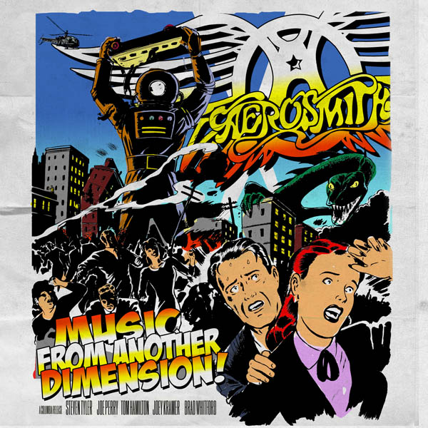
See, this is why you can’t take veteran rock stars at their word. They come out gunning with all kinds of happy horseshit about how the new album will be “back to basics” and a “return to our roots” and how the band is “kicking ass like never before” — and then they premiere the leadoff single on American Idol, they saddle the record with a title plucked from a third-grader’s imagination, and they sign off on a cover that rips off Thomas Dolby.
Goddamn you, Aerosmith, we were actually looking forward to this new album. We wanted to believe all that crap you were saying, even though Steven Tyler has spent the last five years doing everything in his power to actively discourage us from ever buying another one of your records again. You’ve had a frigging decade to come up with some killer new shit. And okay, maybe you have — “Legendary Child” isn’t the best single you’ve ever released, but it’s far from the worst.
But that album title. Those colors. That exclamation point. The Idol performance. It all seems a little too leg-humpingly eager for a band that shouldn’t have to do anything more than stroll out on stage, spin a few dials, and lay us flat.
Anyway, dear readers, here’s where you come in: We’re willing to bet you can design a better album cover than the one Aerosmith chose, and we’re having a contest to prove it. Sit down with your favorite graphic design software, put together some new artwork (preferably artwork that minimizes that crappy album title), and send us a link in the comments. Our expert panel of judges will vote on the submissions and award a $50 Amazon gift certificate to the winner on Thursday, May 31. Let’s see what you’ve got!


Comments