Hello and welcome once again to Confessions of a Comics Shop Junkie, in which I opine on various recently released publications of the sequential graphic nature, some of which may be sitting on the rack at a comics shop, or awaiting the click of a button on some online merchant’s web page, near you. If you’re lucky. Or not, as the case may be.
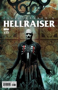
 CLIVE BARKER’S HELLRAISER #1
Script: Clive Barker, Christopher Monfette; Art: Leo Manco
Boom! Studios, $3.99
First time I became aware of Clive Barker’s work, it was thanks to Stephen King’s famous “I have seen the future of horror…” quote. At the time (mid-80’s), since I was deeply into King’s series of now-seminal horror fiction, I took his word as gospel since I hadn’t quite gotten all jaded and cynical and stuff. I went out and tracked down a paperback copy of Barker’s first Books of Blood, which featured “The Hellbound Heart”, which of course eventually became better known as the inspiration for the Hellraiser film, and was quite impressed by the imagination and willingness to go there that Barker exhibited; it was pretty heady stuff to a young twentysomething guy from rural Kentucky, even one who had already been exposed to a fair amount of gore films and Lovecraft, etc. horror writing. After that, I snapped up each new book that Barker put out for several years, and enjoyed reading such odd works like Imajica and The Great and Secret Show…I also recall really liking his prototypical occult detective character Harry D’Amour. I faithfully screened film adaptations of his works like of course the Hellraiser series (the first of which was great, the others…not so much) as well as Cronenberg’s Night Breed (based on his Cabal- disappointing and looked cheap) and Lord of Illusions (even worse). I even bought the first few comic book adaptations of his stuff- one short story adaptation by Craig Russell really stands out in my mind. But sadly, soon, ennui began to set in and what had seemed so exotic and transgressive just barely ten years prior soon seemed repetitive and abstract-for-abstract’s sake, and I just stopped reading and watching. It happens, and this isn’t intended to be a criticism of Barker so much as, perhaps, my attention span.
After the franchise has lain fallow for some time, the always-opportunistic folks at Boom! have moved in and snapped up the rights to publish new comics based on Barker’s concepts, and have now launched the opening issue with much fanfare and hype. Does it live up? Well…sure. Kinda. It is as advertised; Barker (and of course Monfette, unknown to me and most likely the actual writer here) gives us the further exploits, for lack of a better term, of Pinhead and his ghastly entourage, first seen accepting sacrifices of young girls (and I assume guys, too, though it’s not shown) from some sort of scroungy-looking farmer type in a secret chamber on an Nebraska farm. However, our Pinhead has grown bored and unsatisfied with such meager tribute and sport, and yearns for something that transcends the whole pain-v-pleasure thing that is one of the lynchpins of the whole concept. So, we witness his machinations and interactions with other Hellish figures in order to set about achieving his goal. And that’s about it for issue 1, other than a meeting with a female character, an artist no less, who will most likely become either Pinhead’s pawn or adversary or both. I’m sure I’m probably missing a lot as far as who’s who and what everyone’s motivations are; I’ll freely admit that I am not steeped in Hellraiser lore like many of Barker’s most ardent fans and theoretically the audience for this new series of comics is. Anyway, it all comes across a bit overfamiliar- it seems like these are the same story building blocks that go back as far as the first film sequel- and pretentious even, and I have to believe Monfette is the cause of that…but I’m probably underestimating the appetite of not only Barker fans, but horror fans in general, for this sort of thing. The Boom!ers made a great decision to get veteran horror artist Leonardo Manco on board; he is a past master at this sort of gritty, bleak horror stuff, has been ever since the late 90’s and his fine work on Warren Ellis’ take on Marvel’s Son of Satan character, the underrated Hellstorm: Prince of Lies. He went on to do this or that afterwards, including some interesting Western stuff, before landing the regular series artist gig over at DC/Vertigo on John Constantine: Hellblazer, even sticking around as the scripters (Mike Carey, Denise Mina, Andy Diggle, others) came and went, and providing solid, reliable, and occasionally imaginative visuals. Manco really hasn’t advanced much as an artist since his Hellstorm days, but that’s OK; he brings the right stuff to the table for this sort of material.
There’s also a backfeature that assays a story that takes part before current events, dealing with an old man who’s known the hospitality of the Cenobites, and returns with a way to gum up their works a bit, so to speak, and a group of people determined to assist him. Written by Larry Wachowski, it’s fairly engaging, fast-paced story but is hampered somewhat by grubby, rushed-looking art by someone named Mark Pacella, who reminds me a little of someone like Tom Sutton or perhaps Rick Veitch, but he’s not in either league just yet.
The Boom!ers are pretty savvy when it comes to estimating the interest in whatever property they choose to get behind, and I’ve no doubt that this will do very well for them. While I don’t really find anything new or mind-blowing here, I’m sure there are plenty of Barker acolytes who will be all over this and whatever other spinoffs come out. Also, I have a feeling there’s a whole generation out there who may know the films and very little else, and will get hooked (hopefully not on the end of a flying chain) by something that will be a lot fresher to them that it is to me. If you’re on the fence and would like a taste before committing your four bucks, you can go here to download Hellraiser: Prelude, a PDF preview of the series by the ongoing’s creative team; it’s an encounter between a condemned man on the electric chair, a priest, and Pinhead that effectively sums up the tone of what the series is all about. It also has a list of brick-and-mortar stores which should be carrying the comic (my local shop, the Great Escape in Bowling Green, KY, is not on this list, nor is any shop in Kentucky), as well as an online link to a comics shop locator service.
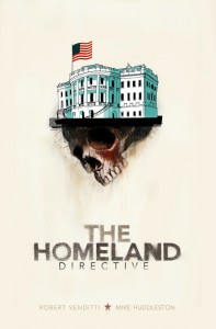
 THE HOMELAND DIRECTIVE
Script: Robert Venditti; Art: Mike Huddleston
Top Shelf Comics, $14.95 (available May 2011)
I really liked Venditti’s The Surrogates; it was sharp and smart and mostly filler-free, and offered food-for-thought on a number of relevant topics, including the cost enacted when people turn over their lives and identities to devices such as, oh, the Internet. Of course, it eventually got made into a motion picture which effectively lobotomized it and turned it into just another Bruce Willis action thriller; an agreeable time-waster but nowhere near as thoughtful as its source material. I had been wondering what Venditti was going to do next, and after some minor stuff here and there for Marvel and a graphic novel script adaptation of the Percy Jackson and the Olympians film, at last we find out.
Turns out it’s a political conspiracy thriller, with overtones of films such as Outbreak. There’s a killer virus out there, apparently, and rather than trying to eradicate it as quickly as possible, the Director of Homeland Security, a holdover from the previous administration, is more than willing to let it spread (this is facilitated by killing those people who are aware of the virus and how to contain it) in order to foster fear and make people more receptive to increased Homeland Security control and reduced personal freedoms. That’s a mighty cynical message, and I’d be lying if I didn’t say that I could buy that easily, especially knowing the type of people that made up our previous administration’s cabinet. And even if it is, ultimately, a bit far-fetched…well, Venditti gives us a well-sketched-out group of protagonists and antagonists, and kept my attention throughout by putting them through their paces with economy and crispness. More so than Surrogates ever did, though, this one reads like a film or TV series pitch, and that’s a little troubling. I also wish there had been more of a sense of really awful apocalyptic bad stuff getting ready to happen to everyone; mostly we’re preoccupied with the pretty young doctor that a group of renegade government employees is seeking to protect (she was on the hit list, y’see, because she researched t his virus) and less so the big picture. When the resolution does come, it’s almost deflating in how matter-of-fact and uneventful it is.
On art, Huddleston’s work is a loose amalgam of styles that, while overall solid, often took me right out of the story upon occasion…on the surface, his work here (and bear in mind that I’m not terribly familiar with his previous efforts such as The Coffin) mostly resembles classic advertising art of the 50’s and 60’s, but with a shifting array of coloring techniques. Scenes within the Oval Office have a blurry, hazy quality, a commentary on the current administration, no doubt, and others don’t really have rhyme or reason, as in the case early on with scenes involving the skinhead, red-nosed assassin employed by the D.H.S, done in a kaliedoscopic burst of bright, saturated color.
Key to the whole thing is the Ben Franklin quote reproduced on the introductory pages, which states “They who give up essential liberty to obtain a little temporary safety deserve neither liberty or safety”. As a chase thriller, this is most effective and really moves. As a political thriller, it is interesting but less gripping. But overall, while this isn’t as rich as The Surrogates, it’s an good page-turner.
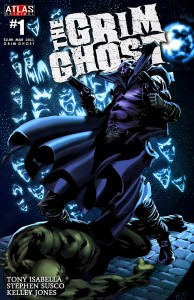
 GRIM GHOST #1
Script: Tony Isabella, Stephen Susco; Art: Kelley Jones
Atlas Comics, $2.99
There’s a lot of throwing of different kinds of crap against a number of walls going on right now, trying to find something that will stick, that is to say catch on and sell, and there are very few failed companies of the last four decades that haven’t seen at least one or two of their properties revived, shined up a little, and thrown back out into the marketplace, in the spirit of “How ya like me now?”. The latest, it seems , is Atlas/Seaboard Comics, the short-lived company founded in 1974 by former Marvel publisher Martin Goodman to compete with the Big Two at the time. While there was some decent talent involved, the titles themselves weren’t all that different from what Marvel and DC were already offering and the line didn’t make it past 1975. However, those characters were still there, sitting on the shelf and in the dark corners of many a fanman’s memory, until Goodman’s grandson Jason decided to come on board and revive the line, with old pro Mike Grell along as editor-in-chief…and this is one of the first results of this new initiative.
I’m not sure how much this deviates from the 70’s comic; while I did read a couple of Atlas/Seaboard books (Chaykin’s Scorpion first and foremost), Grim Ghost wasn’t one of them. I know he was a ghostly highwayman of some sort, a Spectre type that battled Satan and other demons. Go here for more; looks like they did do some repurposing of many of the original concepts. In this take, most of the action seems to be taking place in some sort of purgatory, in which Big Bad “Brimstone”seeks power and souls from the recently dead who arrive there; he was unsuccessful, however, in adding Michael, who doesn’t remember much about his previous life but knows he possesses great powers, and is protected by Matthew Dunsinane, the titular Grim Ghost, who opposes Brimstone and seeks to help Michael develop his abilities. All standard issue good-vs.-evil stuff, and Isabella/Susco try pretty hard to establish mood via melodramatic, bombastic dialogue. Surprisingly, though, what hamstrings this particular issue is Jones’ art. Now, I’ve been a fan of Jones’ work in the past, especially a good long stint on Batman with inks by John Beatty. Perhaps that’s the problem, he doesn’t have Beatty tightening him up…because this is a horrific, sloppy mess. When you look hard, you can see glimpses of Jones’ faux-Wrightson style showing through; certain gestures and poses, exaggerated features on some of his figures. But the whole thing appears to have been painted on animation cels and pressed together while the paints were still wet; it’s blotchy and awkward and crude looking and really undermines everything Isabella and Susco are trying to do. It almost made me wonder if perhaps Jones didn’t have some sort of illness that impaired his dexterity or something along those lines; it’s just that amateurishly bad. I certainly hope that’s not the case, and that this was just perhaps a rush job; in the past Jones has done some excellent work and I’d hate to think that this is the best he can do.
I will say this; it’s got a nice logo. Good work, whoever did it. Otherwise, you can safely pass on this and that’s a pity; the original Ghost was one of the more innovative characters that Atlas/Seaboard offered. Here, they’ve stripped away a lot of that and it looks plain old ugly to boot. Hope that changes.
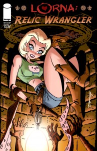
 LORNA: RELIC WRANGLER one-shot
Script: Micah S. Harris; Art: Loston Wallace
Image Comics, $3.99
Now, I’m sure you recall me being less than impressed by the sniggering, smarmy, soft-core porn adventure comic Bomb Queen vs. Hack/Slash last week, and you’ll also no doubt wonder why I would subject myself to what seems like something cut from the same cloth. Well, I’m relieve to report that this isn’t that bad; it’s more high-spirited and less lowbrow. However, the person who coined the old saw that you can’t judge a book by looking at the cover is right once more…A mix of Lara Croft and True Blood‘s Sookie and National Treasure and you name it, this is a labored farce, a satire, I guess, of politics or supernatural thrillers or Tomb Raider films or something. It’s not especially funny or clever, nor does it provide many thrills, but it’s also far from the worst thing I’ve ever read of this nature. , I must admit that the Darwyn Cooke cover made me curious, though, and that’s the story I’m sticking to.
Our Lorna is a perky cute sassy cheerleader type who apparently takes on covert missions form some sort of shadowy “Inner Council”, which looks more like the local Moose Lodge and is led by a white-haired, 70’s tapered-shirt wearing fellow named Verne, who seems to boss around a group made up of presumably filthy rich middle-aged fratboy types who wear fezzes and smoke cigars and leer at her via surveillance cams. She always wears the skimpiest outfits possible, and seems to be confident and in control, but she has grown up playing second fiddle to her hated rival “Posh Meow”, a dark haired Brit who looks like a weird mashup of Sarah Palin and Victoria Beckham. They compete to remove a pyramid from the top of the Washington monument and prevent some sort of cartoony Lovecraftian Elder God from gaining access to our world, and we get a lot of flashbacks to their earlier encounters and spats as they do so. The humor is sub-Mad style, and reminds me a lot of the sort of thing that used to appear in Penthouse’s attempts to do comics a la Oh! Wicked Wanda and the like. Of course, since they seem to be shooting, no pun intended, for a PG-13 rating we don’t get any actualy sex or nudity, just leaden jokes. Wallace strives for that Bruce Timm or Jason Bone animated style and comes this close to pulling it off; the differences and reasons why he falls short are difficult to put one’s finger on; just a matter of attitude, I suppose; a stance here or a pose there that could have been this but turned out to be that. I think there’s room for improvement for sure, he’d probably do a bang-up job illustrating something like Paul Dini’s Jingle Belle or Polly Green characters. The one-shot is filled out with pin-ups, and they’re a mixed bag as well; Aqua Leung‘s Paul Maybury does the best of these. Finally, there’s an EC-tribute short story with really poor art that looks like Jill Thompson on Thorazine, and makes the Sookie Stackhouse comparison more evident. Worst of all, the joke at the ending isn’t particularly amusing. I don’t know if I can recommend this; I’m sure others might find it funnier and more clever than I. That Cooke cover is pretty good, but if you’re like me the days when you can drop four bucks for a single illustration are long gone, even if there’s a nice Maybury piece inside as well. Your mileage, as they say, may vary.
That’s it for this week! As always, thanks for your attention and hopefully I’ll see ya next week.
The All Purpose Ever Popular Review Writing Music List: Prince and the Revolution: Parade; The Essential Sly and the Family Stone; Mike McGear- McGear; David Bowie- Toy.


Comments